top of page


The Objectives
Develop a packaging and branding system that celebrates Bosco’s pride in premium, home-grown ingredients. The goal was to stand apart from mass-market pasta brands while honoring the company’s family-driven heritage and authentic roots.
The Results
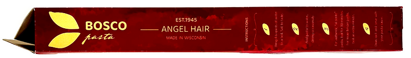
The Bosco Pasta identity centers on rich, earth-toned colors that evoke warmth, tradition, and craftsmanship. Clean, modern typography introduces a fresh energy without losing touch with the brand’s history. The packaging system’s simplicity and adaptability allow it to scale seamlessly across box sizes—preserving a sense of sincerity and quality in every detail.
Photoshop • Illustrator • Typography • Mockups


HEX: #37141A

HEX: #50111C

HEX: #8F292C


HEX: #FAC064
HEX: #9C8368


CREATION
PHASE 6: MOCKUPS

bottom of page